
 |
| Quilt by Karen Woodruff |
Like most design decisions, it comes down to what you want your design choice to do. There is nothing good or bad but thinking makes it so. Or makes it sew.
It comes down to materials and visual choices. There are two items we're talking about at the moment: fabric and thread.
Materials:
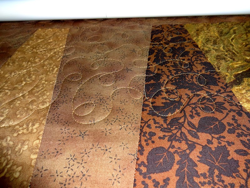
We've talked about fabric that's made to match. There are three ways to think about matching colors. We can match as closely as we can, pick several choices that blend with each other but are not identical,
Contrast strongly with a different color, print size, or style. These choices are neither right or wrong. But they do make a statement.
Match as closely as we can.

This is best only when we really can match. If it's close, it often doesn't win a cigar. It can look very awkward. If you can match your colors pretty exactly, it gives a smoother quieter feel to you design.Pick several choices that blend with each other but are not identical.
 |
| Sue Makinen's quilt doesn't match colors but it blends them beautifully. |
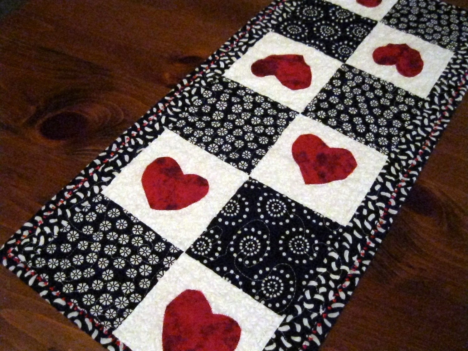
Contrast strongly with a different color, print size, or style
 |
| Bright colors don't need to match. They contrast. |
If we really can't match it, don't. Pick a fabric that contrasts strongly with the others. Complementary colors work very well for this. Or pick something that is much lighter, darker, stronger, bigger, smaller, or in some way different. It will shine out like a diamond.
Threads:
Piecing:
Quilting by machine always shows the thread color more because the whole stitch shows on both sides. A hand stitch shows in stitches in and out with the running stitch. It is visually less obvious and makes more of a dimple across the surface than a line.
Threads:
Piecing:
- Choosing thread for piecing is about neutrality. What color can you find that sort of blends with everything you're using. Gray, white, black and beige are really good things to start with. If you're ironing your blocks with the seams turned to the dark side, you, me and God are the only ones who will know. And God and I will be silent.
- Quilting:

From Wendy Shepherd at Ivory Spring
If you feel confident about your quilting skills, nothing is as showy as a contrasting color quilt thread. It's pretty.
Of course if you're a little less sure of yourself, a thread that matches will be more forgiving of uneven work or small boo boos.
From Wendy Shepherd at Ivory Spring
When we're matching thread,we want to go one shade darker than you're color. Thread looks darker than it is on the spool just because there's more of it in a chunk. Once it's a single thread, it will look slightly lighter.
Quilting by machine always shows the thread color more because the whole stitch shows on both sides. A hand stitch shows in stitches in and out with the running stitch. It is visually less obvious and makes more of a dimple across the surface than a line.
As we said, there's no right or wrong way. But it helps if your choices are intentional. Because it gives you much more control over how your quilt looks.


.jpg)