Threadbenders Quilt Shop

Threadbenders Quilt Shop

Friday, April 11, 2014

Challenging Times: How Challenge Quilts Help Us Grow

If you belong to a quilt guild you may have made a challenge quilt. They're fun. You're given several fabrics to work with and you see what you and your friends make of that.


But not all challenges are that formal. When you're in a group with quilters it sort of happens naturally.

We got this red and cream collection of fabric. Paula looked at it and decided she needed to make a hunter's star. It was so cute.


Peg loved it. But she wanted to try it as a lazy l quilt. Such a fun dancing pattern. She made a great lime binding for it.
Wanda made a great disappearing nine patch. And decided she had to put a lime border behind it. 

Would Wanda have made this great quilt if Paula hadn't made her's?  Maybe. Wanda's pretty amazing. But Paula made hers. Peg made hers. And that got Wanda going.

If we are around other quilters, we learn from them, we try what they try, we find new ways.  

So go find some quilters, and just as you watch them, you'll find yourself challenged to new things. Of course the day to day easy way to do this is to walk into the quilt store and see what's new. And we're here every day but Sunday.

Come in and see what you're challenged to do next.


Wednesday, April 9, 2014

Solid Backgrounds: Anything but Plain

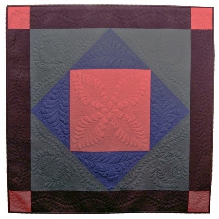
Diamond in a Square, Lancaster County, PA, c. 1925. Gift of Irene L. Walsh.
We've spent over a week looking at backgrounds.

 It's worth saying that a quilt is all in a whole. 


An amazing piece of piecing with wild prints has it's own drama. No matter how you quilt it, the piecing and the fabric take the show.


If you treasure the quilting part of quilting, a solid fabric makes a much better surface.
Amish square

The Amish people have given us a huge legacy of some of the most beautiful and unique quilts to come out of  America.
Amish, Lancaster Co., PA | DIAMOND IN THE SQUARE QUILT (detail) | c.1930 | pieced wools | On loan from Keny Galleries -
Amish quilting reflects the simplicity and plain design of the Amish life style. The quilts are solid, plain patterns, sometimes in bright colors. But they quilt. Boy, do they quilt. All of these simple squares or squares on point quilts are encrusted with quilting, of every kind. Some are just simple grid stitching. Others are masterful feathers, curves, clam shells, and stars. 


http://www.hqnawinterfest.com/darci-amish/
Although Amish quilting is part of their unique lifestyle, they're quilts have affected how we all see pattern and design. These plain, solid squares are a canvas for the design of the stitching.
Nestlings Ellen Anne Eddy


Here is a contemporary Amish that was pieced and quilted by machine, Like most things borrowed by popular culture, we've taken the idea and as quilters, run with it. The colors are brighter, the stitching is by machine, but at heart, it's a lovely blank place to quilts.
Nestlings detail

And in the world of long arms, so much more quilting is possible.


If you're getting ready to quilt your masterpiece, you might want to think about solids as a way to showcase your stitching.

If you'd like more information about the Amish, you can start at Wikipedia. Here's a bit from their article about Amish people.
The Amish (/ˈɑːmɪʃ/ ah-mish; Pennsylvania Dutch: Amisch, German: Amische) are a group of traditionalist Christian church fellowships, closely related to but distinct from Mennonite churches, with whom they share Swiss Anabaptist origins. The Amish are known for simple living, plain dress, and reluctance to adopt many conveniences of modern technology. The history of the Amish church began with a schism in Switzerland within a group of Swiss and Alsatian Anabaptists in 1693 led by Jakob Ammann.[2] Those who followed Ammann became known as Amish.[3] From Wikipedia

Sunday, April 6, 2014

A Tale of Three Backgrounds: Blending Multicolor Prints


We looked at how the size of a print changes it's value last time.  But those prints were all the same colors, one shade of red and white, changed by the size of the print. Now we're going to look at prints of more than 2 colors.


How much does that change things? In some ways, a lot. In some ways not so much. But you want to be the one in control of your quilt. Knowledge is power.

Here is a range of green, yellow, white and brown prints in differing sizes. Several of them have 
bits of red in them.


A cream color background gives us a very neutral base, where only the pattern within the blocks  show. Incidentally, it would also leave you with four corners you could quilt to a fair-thee-well. It's clean and simple


This cream and medium green background is more textural. The green leaves pull out the olive in the blocks. It's a busier background, but it functions as a slightly olive green cream color.


This third print, with is larger daisies, is harder to classify. It's definitely got yellow splotches that brighten and randomize the background.


What does this tell us about prints as apposed to solids?
A solid color is:

  • Simple
  • Plain
  • Shows up the prints within the block
  • May show dirt or soil
  • Will show extensive quilting

A small print will:

  • Add texture
  • Add or extend the colors in the block
  • Hide quilting

A larger print will:

  • Add a random textural element
  • Add patches of color to the cream background
  • Will show some quilting, but not anything extreme
  • Probably won't hide soil or wear.
All of this can help you make the best fabric decisions for your quilts. Try everything, and see what you like best.


Friday, April 4, 2014

Waltzing with Prints: Picking out Printed Background

 We've looked a lot at how different background colors affect a quilt. It's a dramatic element in every quilt. The background sets the tone and shows off the rest of the colors. It's a really important decision.
But what if you're using a print? 


Prints are a "wysiwyg" experience. What you see is what you get. And, as always, they are in relationship with each other.
I have a selection of fabrics that are printed as a collection, and the red is the same in all of them.
 A red on red print
 Red on White paisley
 White on red paisley


 Dit and dot  print


 Chain print

The values of these fabrics, dark to light, even with the same red and the same white are very different. Why?
The size and the density of the print. More red than white?
Probably looks darker. More white than red, it will read as lighter. If you're working on a range like this, you may want to choose the pieces with the strongest value differences, because that is going to make your contrast.

How can you tell? As we said before, what you see is what it is. You just have to look the right way. When you're looking at a print up close, say in your hand, you really can't tell. Walk away and look at it at distance. You may want to take it into  real sunlight. Some kinds of lighting make colors appear to be very different.  And you can squint at it. Squinting makes you more able to see the value of the fabric rather than the print or the color.

Cottage Mills Color Evaulator II Red and Green Filter

Finally you can use a color evaulator. There are many kinds. This one offers a green view as well, just in case you're working in red.

So when you see a group of quilters squinting across the room from their fabric, you now know that they're checking the value. Or they have something in their eye.  Either way,it's a whole other way to look at our fabrics and our fabric choices.


Wednesday, April 2, 2014

Absolutely Shocking: Lime, Orange and Pink as Backgrounds.

From Cristin at "Sew This Is My Life on Magpie Quilts
There was a saying about 10 years ago. Lime is the new neutral. Everyone sort of shook their heads and bought some lime fabric. And we discovered that very bright backgrounds make the other colors positively shine. Magpie quilts was saying that grey is the new neutral, but for this quilt I would argue that the neutral here is the green.


Does any of that matter? Don't be silly. All the colors are in it together. And it's hard sometimes to say which is the background and which is the pattern. I'm just saying when there's a lot of lime green around, the quilts are electric. 
From LollyQuiltz made by Carla

It's true for so many colors. If it's bright and fun with a white  background, imagine it with arrest me red. Bright colors just make other colors more excited and exciting.

For that matter any color you see as eye popping and outrageous probably makes for an astonishing background. Even if its a color you wouldn't usually use.


Orange Explains it All, DC Modern Quilt Guild
Orange is another electric color. Orange was so overdone in the 70's that it disappeared in the 80s. But you can't keep a good color down. It's back and it's beautiful.


From Connie at How to Hand Quilt and More

Hot pink is no shrinking violet either. Yet it makes this black and white cow completely eye 
catching.


As you pick out backgrounds, try at least one color you consider just too bright for contemplation. It may surprise you.

Sunday, March 30, 2014

Black backgrounds: As Bright As it Gets

McCalls Night Light Pattern
We've been talking about backgrounds for a while. Most quilts use muslin cream or white fabric for the background. But what happens if you don't?
Dear Jane Quilt (Civil War Reproduction Fabrics) 
Let's look at two Dear Jane Quilts. These are exactly the same paper pieced designs in two different color ranges. This is the quilt made with civil war replicas.
Dear Jane with brights and blacks by Chantal Guyon

This is the quilt with a black background. 
Do I now have your attention?
Quilt made from Laurel Burch Fabric


Most people think of black as funereal and depressing. It may be true about black dresses, but it's not true with quilts. Any time you want your colors to shine, bring on the black.


Amish Quilt From Diary of a Smart Chick


It's not a new idea either. This Amish star is a pre-1940s  quilt. The Amish quilts of that time often featured black backgrounds. The colors positively glow against the black. They knew the value of bright color against deep black.


Albert Hoffman's Orbit by Maria Shell at Tales of a Stitcher

Even thread work glows against a black background. The only color on this awesome stitching is the thread itself. The denser the stitching, the deeper the color.


Meredith's bright and black quilt from Girls in the Garden
 Actually that's what makes a black background so effective. Most exciting art celebrates contrast in some way. You can have contrast in colors, or in print sizes, or in value, the darkness or lightness of a color. Nothing is darker than black. So it contrasts everything around it, making even duller colors shine.

So, don't be afraid of the dark. The next time you want to make a knock-your-eyes our quilt, get out the black fabric and expect to be blown away

Friday, March 28, 2014

White or Cream or Something Between: Backgrounds

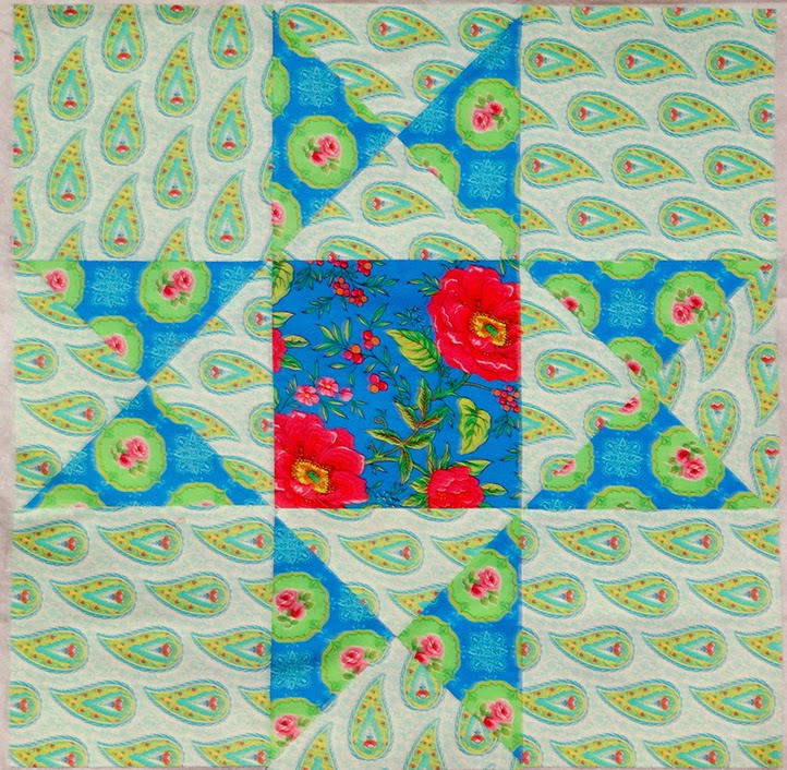
Peg's Ohio Star
We've been talking about backgrounds. They do matter. In fact they make every color shine. Is white really white? Is cream all that different? Of course they are. There are really good reasons to choose what works best with your other quilt colors.
from Blue Square Quilting
White is always crisp. It's showy. It gleams a bit. 
From Sweet Home Northwest
White makes things look a big faded, which does the 30's look.
On Etsy
White is a great accent. These eyes pop because of the white.
White does well with blues, greens, crisp cool colors.
From A Quilt is Nice
But it also brightens a scrap quilt.
What does cream give us?
From Pots and Pins
Cream makes a soft look.  It's a quieter gentler background.
From Fat Quarter Shop 
It makes an instant antique.
on Etsy
And it's always a soft companion to beiges and browns.


Peg's Fabric

Back to Peg's quilt. That very cool green paisley looks white in the quilt. Why? Because it's always in relationship to the other colors and fabrics.
Use white for a 
Crisp
Clean
1930's
Blue or 
Bright Look

Use Cream for 
Antique
Soft
Brown
Homespun or
a frontier look.
And make sure you look at both, with your fabric when your choosing. The colors are always in it, together.